FT Professional forms
Overview
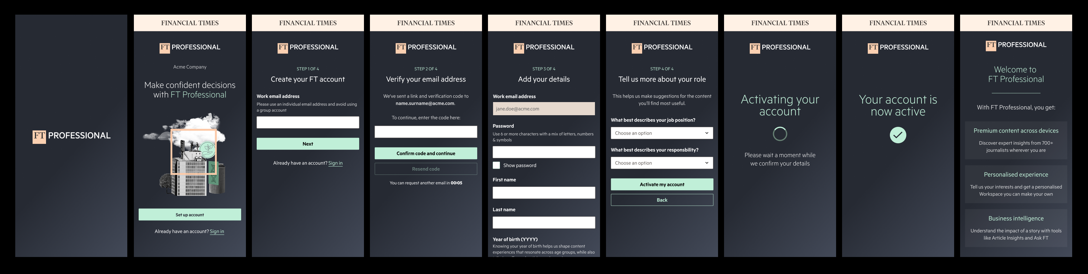
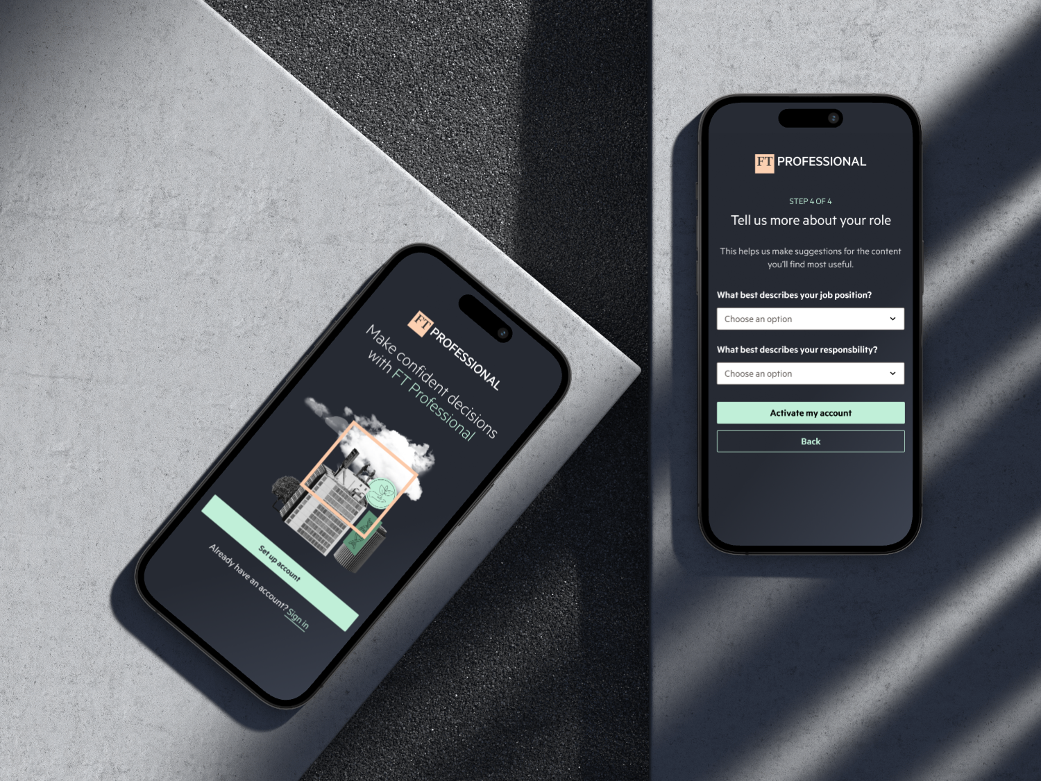
This project involved completely redesigning and rebuilding the signup forms used by FT Professional readers to create their accounts, while also serving as a critical point for the business to collect essential user data such as job role, responsibilities and consent preferences.
Originally adapted from consumer-oriented signup processes, these forms had become technically complex and difficult to maintain. The outdated structure resulted in poor user experiences, low conversion rates (only 23%), and challenges in tracking and optimising performance. Additionally, these forms limited our ability to effectively deliver the value of the FT Professional subscription from the start.
Our goal was to simplify and streamline the signup journey, enhance data collection for personalisation, and establish a robust, scalable foundation for future improvements.
My role
- End-to-end design lead: Led the redesign of FT Professional’s forms, from mapping undocumented logic and edge cases to delivering a streamlined, user-validated experience
- Data-informed decisions: Combined analytics and qualitative research to identify friction points and shape the new user flow
- Design & tech debt cleanup: Partnered with engineers to untangle legacy design and code, simplifying the form logic
- User testing & validation: Developed interactive prototypes and supported my research partner in conducting usability tests
- Cross-functional collaboration: Worked within a cross-functional team (Product, Research, Content, Data, Engineering) and liaised closely with Product Marketing, Operations, Customer Success and CRM stakeholders to align on goals and deliverable
- Fast-track delivery: Delivered the full end-to-end experience in 6 months as part of a dedicated, high-priority task force
Problem
Despite being the first touchpoint for many FT Professional users, the join forms were letting people and opportunities slip through the cracks. The experience was confusing and inconsistent; users were often asked for the same information twice, didn’t know whether they already had an account or dropped off entirely when faced with unclear instructions around setting a password.
Behind the scenes, the forms had become a patchwork of variations with no clear ownership and little documentation. This made them hard to update, test or even understand. Teams across the business - from marketing to customer success - relied on the data these forms collected, yet much of it was either incomplete, misaligned across license types or not surfaced in a usable way.
Most critically, we lacked visibility. We didn’t know where users were falling off, what caused errors or how different segments were performing. Without this, it was difficult to improve conversion or deliver personalised experiences. What should have been a smooth, welcoming entry into FT Professional instead became a barrier - one that was costing us both users and long-term value.
Process & solution
This project kicked off with a deep dive into the existing forms infrastructure - a critical step in understanding what we were working with. Much of the original build lacked documentation, so I spent time mapping out the underlying design and technical logic. This involved identifying edge cases, legacy constraints and hidden dependencies that had accumulated over time. The goal was to untangle how these forms functioned both from a user experience and engineering perspective.
With that baseline established, we held a workshop with key stakeholders across FT Professional to surface current pain points, feedback from their teams and any known friction in the user journey. This qualitative input was paired with quantitative insights from analytics, allowing us to pinpoint where drop-offs occurred and where users were most engaged.
From there, I worked closely with engineers to start “undoing” both design and technical debt — streamlining the flow, simplifying field logic and removing unnecessary barriers. We continually mapped new flows, integrating feedback loops from stakeholders to ensure alignment.
Once the new forms were in place, we moved into user testing. Participants described the new journey as “easy, straightforward, and quick to complete”. The only point of confusion was around consent preferences - an issue already flagged as a known challenge across the business due to compliance and legal constraints. Importantly, the rest of the form experience was consistently seen as simple and appropriately concise.
Given its business-critical nature, a dedicated task force was formed with cross-functional members from FT Professional, and we were given just six months to deliver the end-to-end transformation.


Impact
- Increased form conversion from 23% to 60%, resulting in an additional 165,000 activated FT Professional users annually
- Our work also played a key role in the FT-wide first-party data initiative, which aimed to increase the number of users we have core data points on. The redesigned FT Professional forms have contributed 223,000 recognised users to date, making them one of the primary sources of acquisition and data capture across FT.com
- Created comprehensive documentation covering user research, key flows, edge cases and future growth opportunities
- Contributed to laying the foundation for the FT’s long-term data and personalisation strategy
*Data as of May 2025